Sounding Board: Launching a New Brand Through Experiential Design
summary
overview
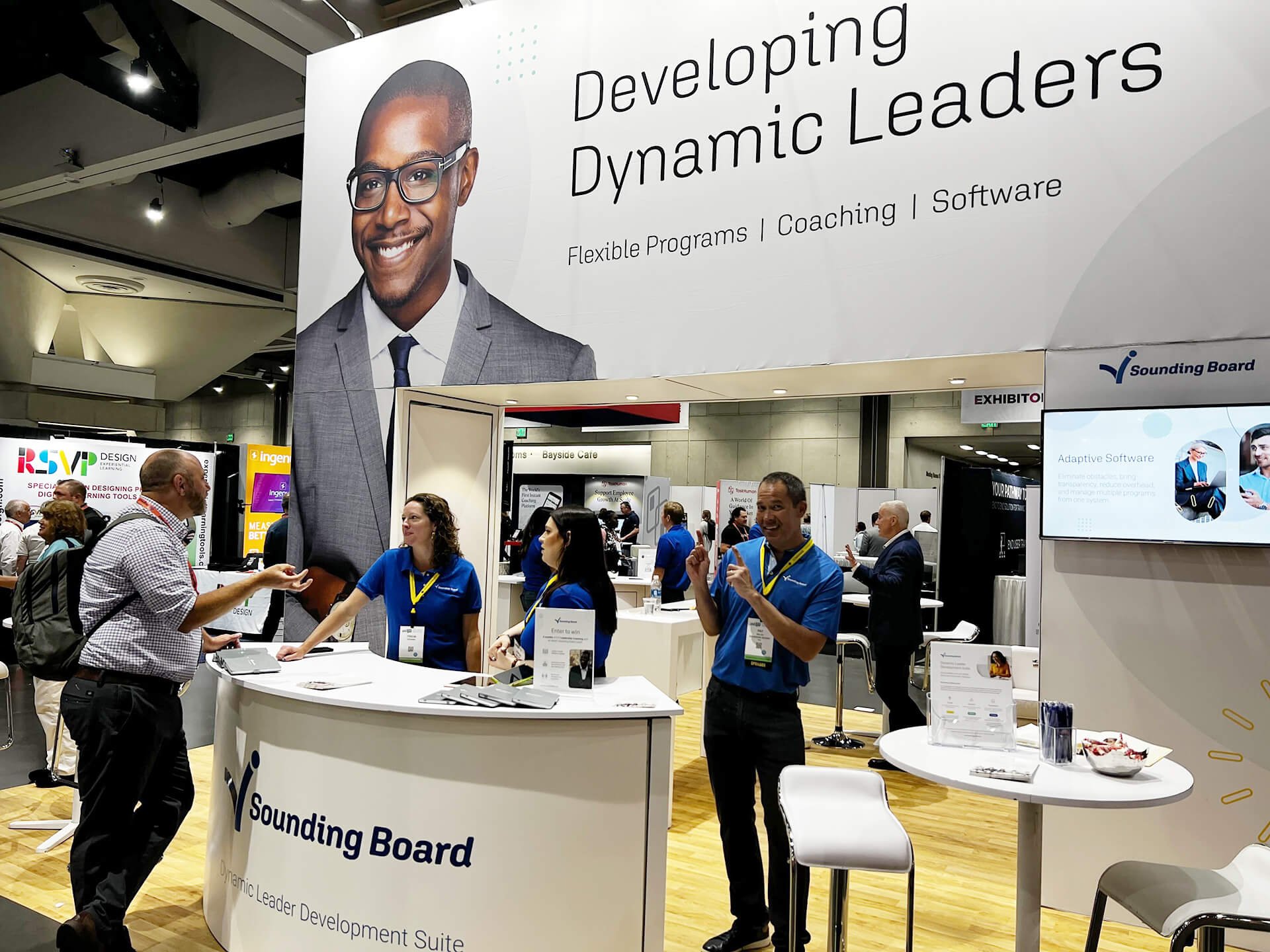
Designed and executed the launch of Sounding Board’s updated brand identity within a major industry trade show environment. The brief included creating an immersive, visually coherent 20ft × 20ft space that communicated the refreshed brand position and supported targeted engagement with senior HR and people-leader audiences.
challenge
Sounding Board required a brand debut that felt authoritative, clear, and aligned with its updated visual identity—despite operating with the constraints of a startup environment. The project involved interpreting a newly defined brand system into a three-dimensional setting that was both recognisable and meaningful to the organisation’s core audience.
Translating the brand into spatial design demanded careful consideration of visual hierarchy, messaging clarity, and experiential flow in a temporary environment. This work also required aligning diverse stakeholder expectations and ensuring the final design could be implemented within production and installation constraints.
my Role & services
Experiential & Spatial Brand Design
Brand System Translation
Communications & Environmental Graphics
Visual Hierarchy & Messaging Strategy
Cross-Channel Visual Alignment
industry
B2B
SaaS
Silicon Valley Tech Start-up
Professional Development
Design Process
step 1: Logo & Motion Exploration
For this launch, motion was an important part of making the updated identity feel confident and contemporary. I explored several logo animation directions with the marketing team and refined timing and feel through iteration. We landed on a subtle “bounce” to reference the idea of bouncing ideas off one another.
step 2: sizzle reel sequence
I developed a short “sizzle reel” sequence built around shapes that assemble, morph, and resolve—reflecting change, development, and progress. As the animation evolves, the shapes become masks revealing footage centered on human connection and leadership. The final sequence was adopted beyond the event and later incorporated into the company website.
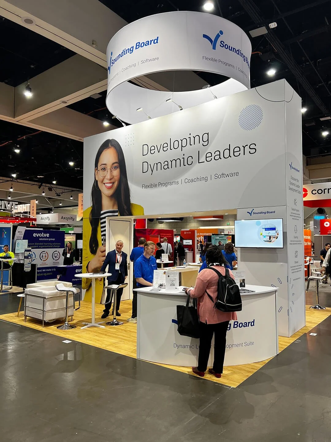
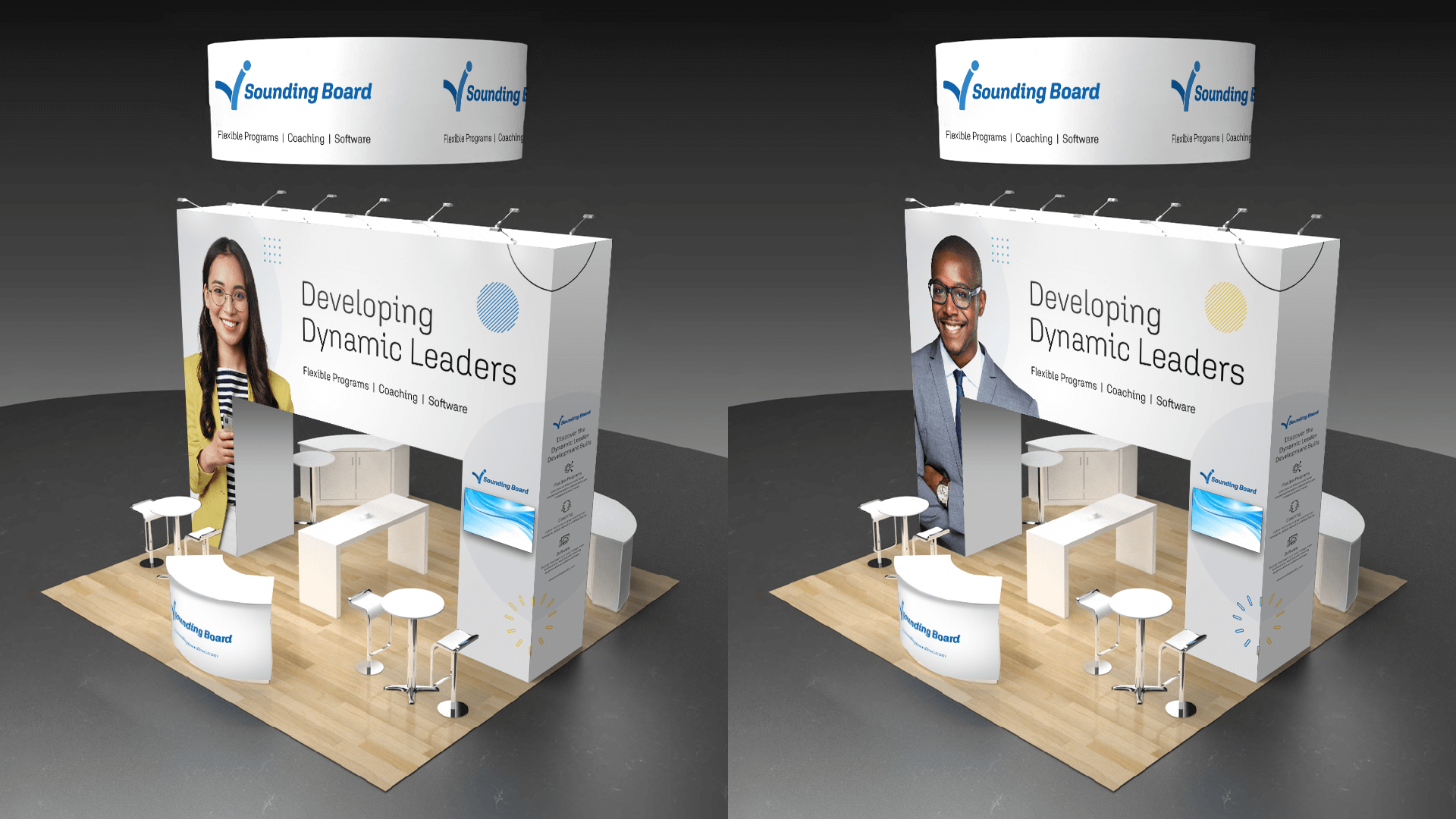
step 3: Booth & Spatial Design
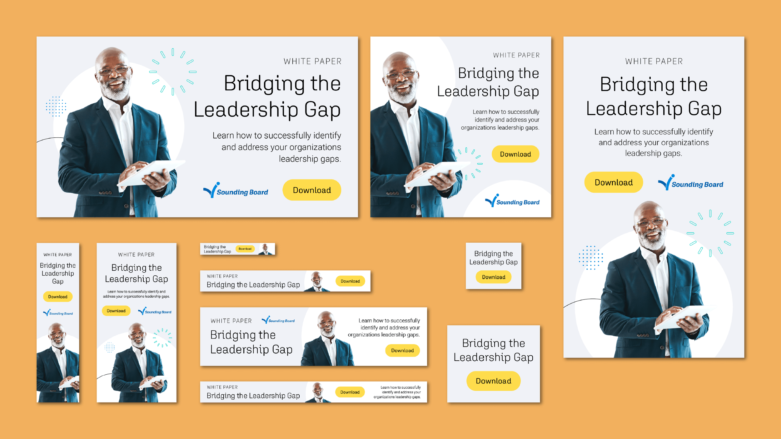
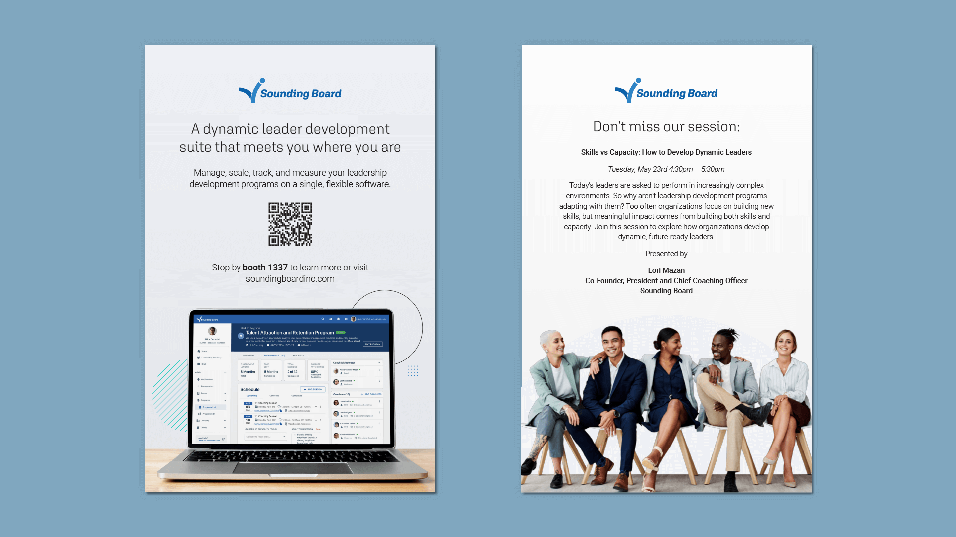
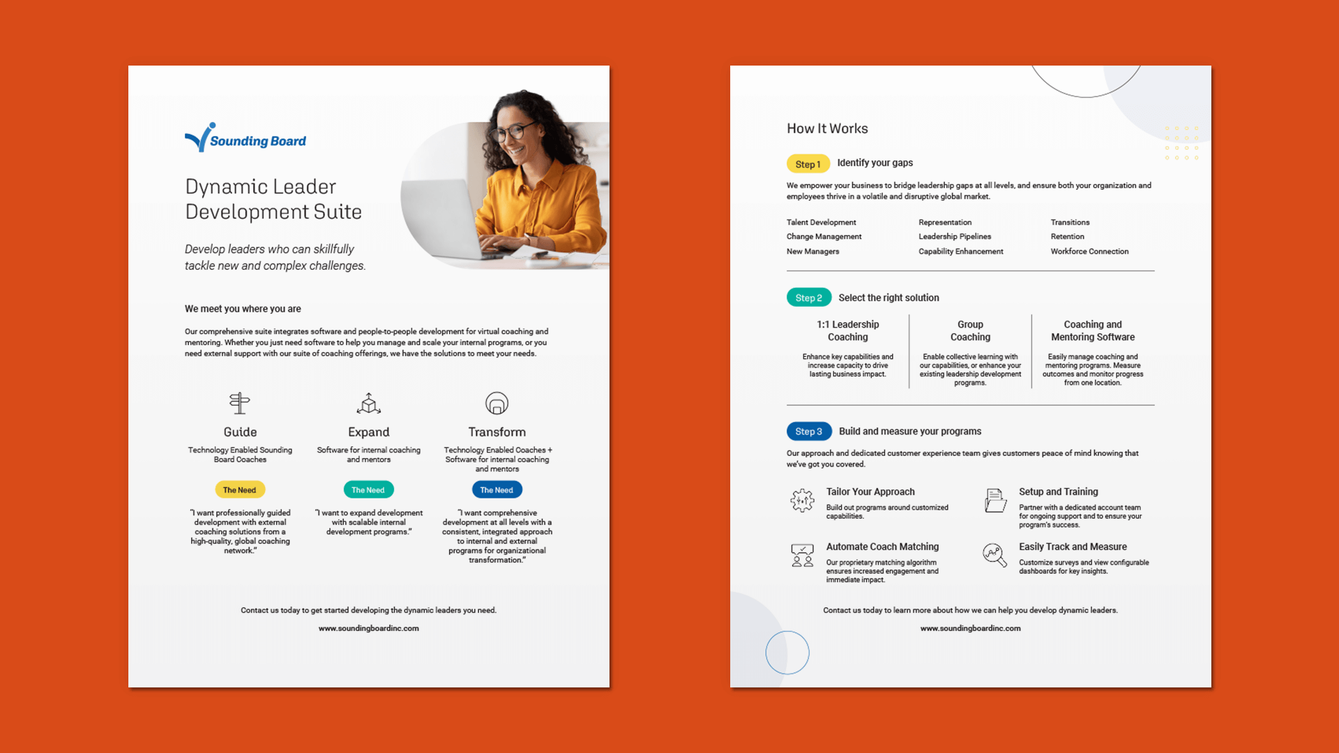
The next phase was designing the booth environment as the primary expression of the rebrand at the event. The wall content needed to communicate clearly without overwhelming the space, so I focused on hierarchy, spacing, and legibility from typical viewing distances. After exploring several layout and colour directions, we aligned on a contemporary, minimalist approach that supported the message rather than competing with it.
step 4: revisions and feedback
Before finalising, we reviewed the design internally with particular focus on colour usage and readability in a real booth context. Through multiple rounds of feedback and refinement, we reduced colour to purposeful accents—using it sparingly to draw attention to key messages and improve clarity across the space.
Gallery

impact & Outcomes
The project established a repeatable approach for integrating Sounding Board’s visual system into physical environments. By translating the brand into space and messaging, the design work strengthened the organisation’s external presence and provided a consistent experiential foundation for future events.
-
Successfully introduced the new brand identity in a high-visibility, competitive trade show environment.
-
Translated the visual system into a spatial context that maintained coherence with the broader identity.
-
Organised visual and textual elements to support clarity for HR and people-leader audiences.
-
Developed design patterns and asset categories that can be adapted for future trade shows and environments.